Dream QuiZzz Game
This project is still running and is under NDA clauses, making it not possible to share some details.
Trivia games are an opportunity to learn more about several topics and have fun. On the other hand, this genre could be less engaging than other ones that generates more dopamine through sound and image stimulation. Besides that, adventure games normally are considered the most thrilling game genres.
What if a trivia game could have game adventure elements, with a rich visual and captivating storytelling?
What if a trivia game could have different stages, thrilling missions and motivating goals, while the player answer questions and increase the knowledge?
Join on Dream QuiZzz Game beta test at ocarinastudios.com
CLIENT
Ocarina Studios – Vancouver, BC, Canada
LOCATION
Remote
PERIOD
March 2023 to January 2024
SOFTWARES
Figma, Illustrator, Miro, Jira,
Confluence, Slack
DELIVERABLES
Research, styleguide, high fidelity prototype
Interactive Figma prototype link available on desktop and tablet versions.
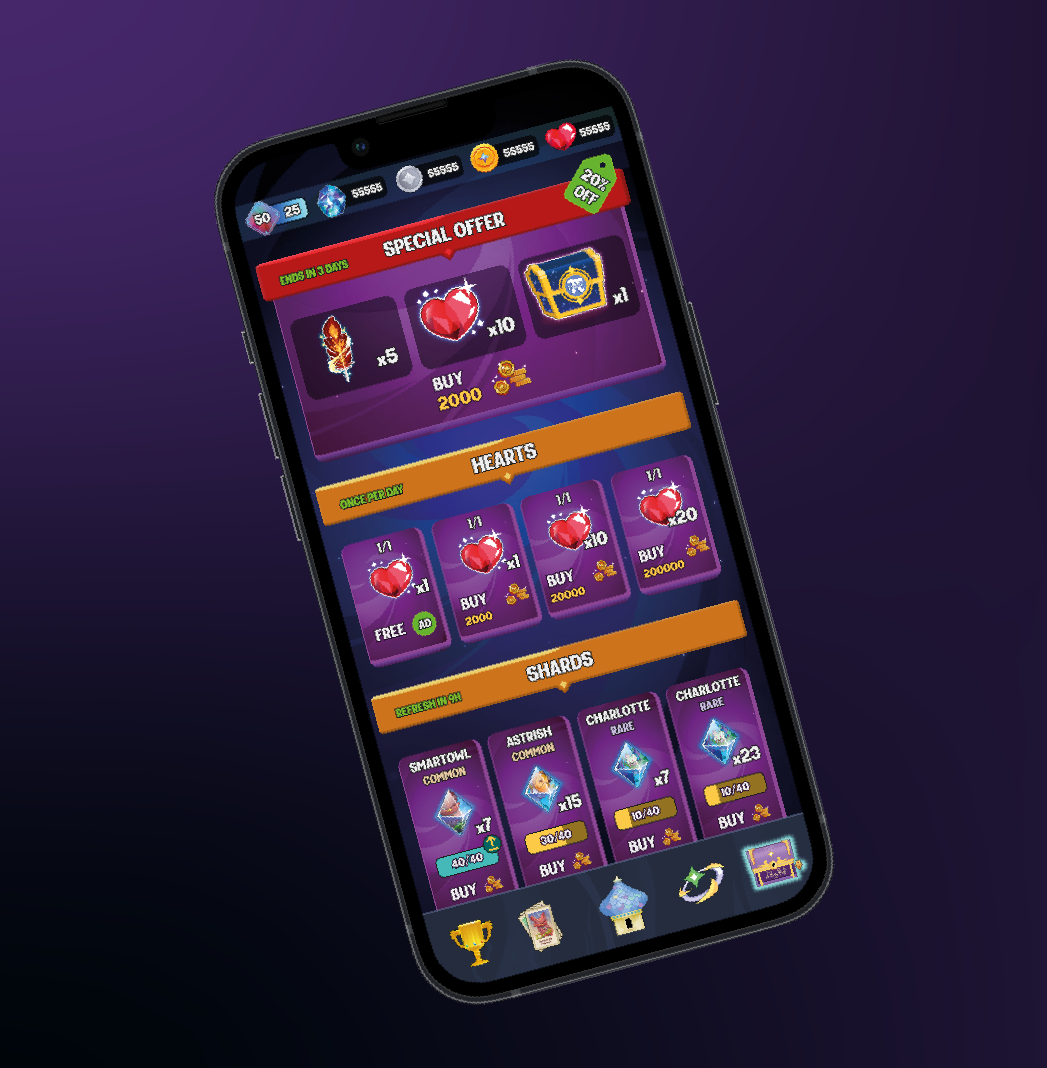
The challenge
Decide between vertical or horizontal layout was one of the great decisions of the project because games that have maps are commonly horizontal, and trivia games are normally vertical.
As an adventure/trivia game, conciliate the positioning of a big amount of menus, submenus and features from different genres was a complex task.
Understanding the user flow to create a way to show what task is relevant for an specific moment on game. The player needed to be always aware and engaged.
Choose how to combine UI elements (buttons, containers, menus) to game illustrations in order to create a harmonious look and a captivating experience.
The solution
Vertical layout was chosen because it seems more natural for interaction on smartphones. Besides that, the user can zoom in and zoom out on maps when it is necessary.
About the menus, submenus and containers, the decision was to create a bottom bar to concentrate the most important game features and the secondary ones floating on home screen, with the main map on background.
About the player engagement, an alert system was created in different screens, keeping the user always aware about the achievements and bonus.
Regarding the colors, the combination between soft tones on bars and menus with the vivid shades on illustrations created a balanced look.
The process
Product requirements: team leaders validated the MVP features with the entire team.
Brainstorm: art team, UX UI team, game designers and team leaders created different alternatives for the product.
Documentation: game designer and UX UI designer defines the screen elements and its behaviors.
Interface: lo-fi and mid-fi mock-up creation and validation with game design team.
Prototype: hi-fi prototype creation to share with the entire team to collect feedbacks and making final changes.