AmaVille
AmaVille is a daycare center focused on individualized attention to children from the age of two until literacy. Its philosophy is to provide personalized attention to the needs of children, including those on the autism spectrum, physical limitations or neurological conditions.
The venture was born from a dream of creating a safe environment for children to learn, play and develop their skills surrounded by competent professionals full of love for education.
CLIENT
AmaVille School – São Luís, MA, Brazil
LOCATION
In person
PERIOD
April 2021 to September 2021
SOFTWARES
CorelDRAW, Photoshop, Illustrator
DELIVERABLES
Research, visual brand, visual identity
elements, brandbook
The challenge
Clients had solid experience in the educational and management areas in private companies and, at a certain point, they understood that it was time to undertake and put their experience and energy into their own business.
Before the design services began, they had already thought of some random names for the business, but they needed to understand that, before defining the name, it was necessary for the business to have a concept that supported that name. A concept that could speak to its audience and touch the hearts of children’s parents, teachers and the community in which the business would be located.
The challenge then became to create a corporate identity that could captivate parents and children, attracting customers to a nascent business in a fragmented market with several competitors working to attract the attention of customers. It was deemed necessary to convey an image of commitment, warmth and trust, so that the audience could connect with the business, even though it was a new player in the market.
The solution
Therefore, entrepreneurs understood the importance of creating a strong and coherent corporate identity that could be synthesized into a strong name and visual identity.
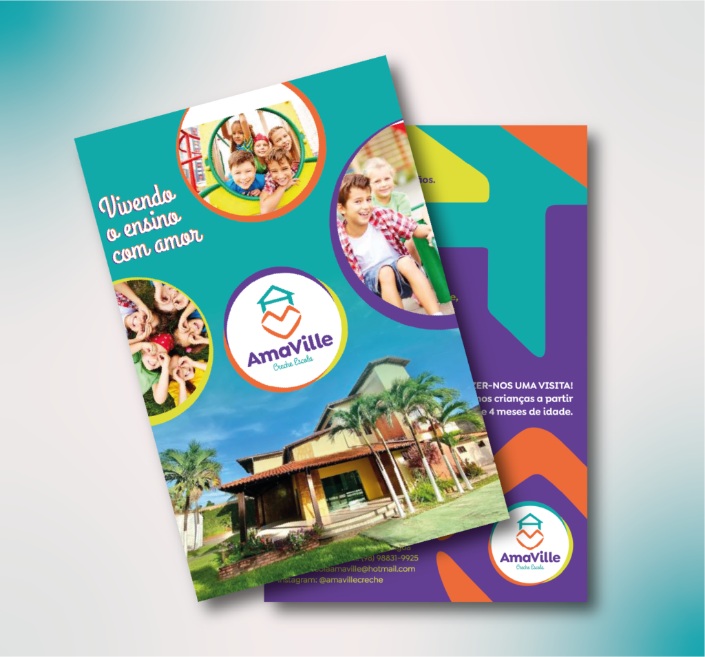
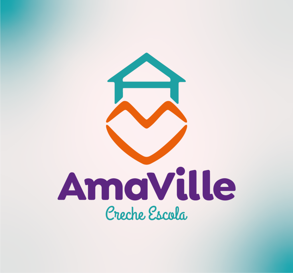
After researching competitors, both in the local context and in other markets, the name and concept of AmaVille was arrived at – a village of love, care and learning. The idea of a village goes back to a small town where people connect and have a close relationship, while the word love summarizes the main motivator of entrepreneurs working in early childhood education.
The desire that the children under their care could learn, have fun and receive solid personality training in a safe and stimulating environment.
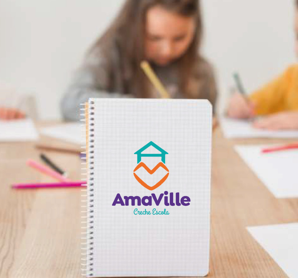
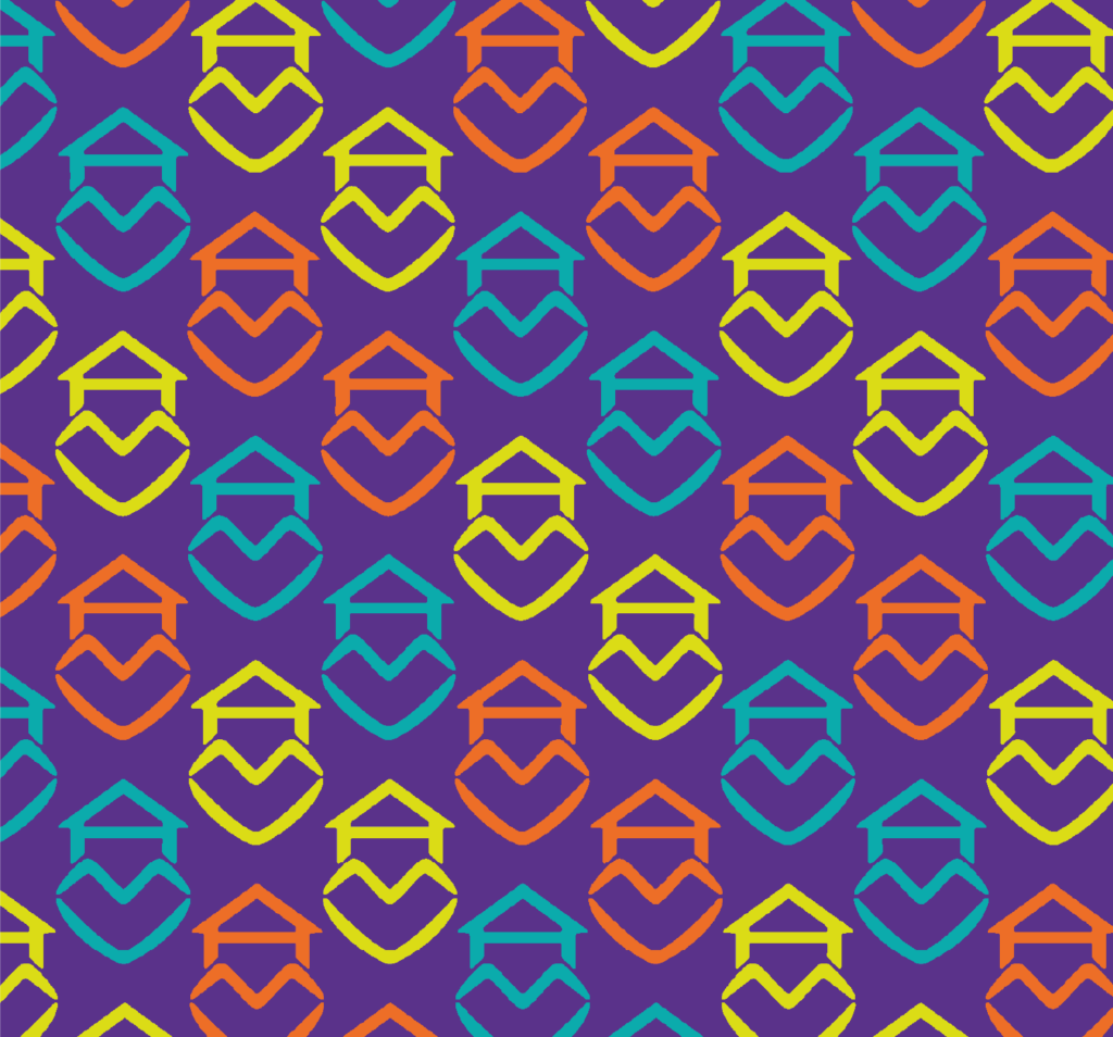
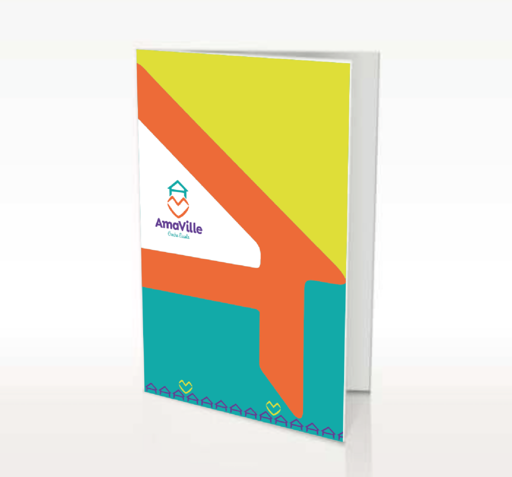
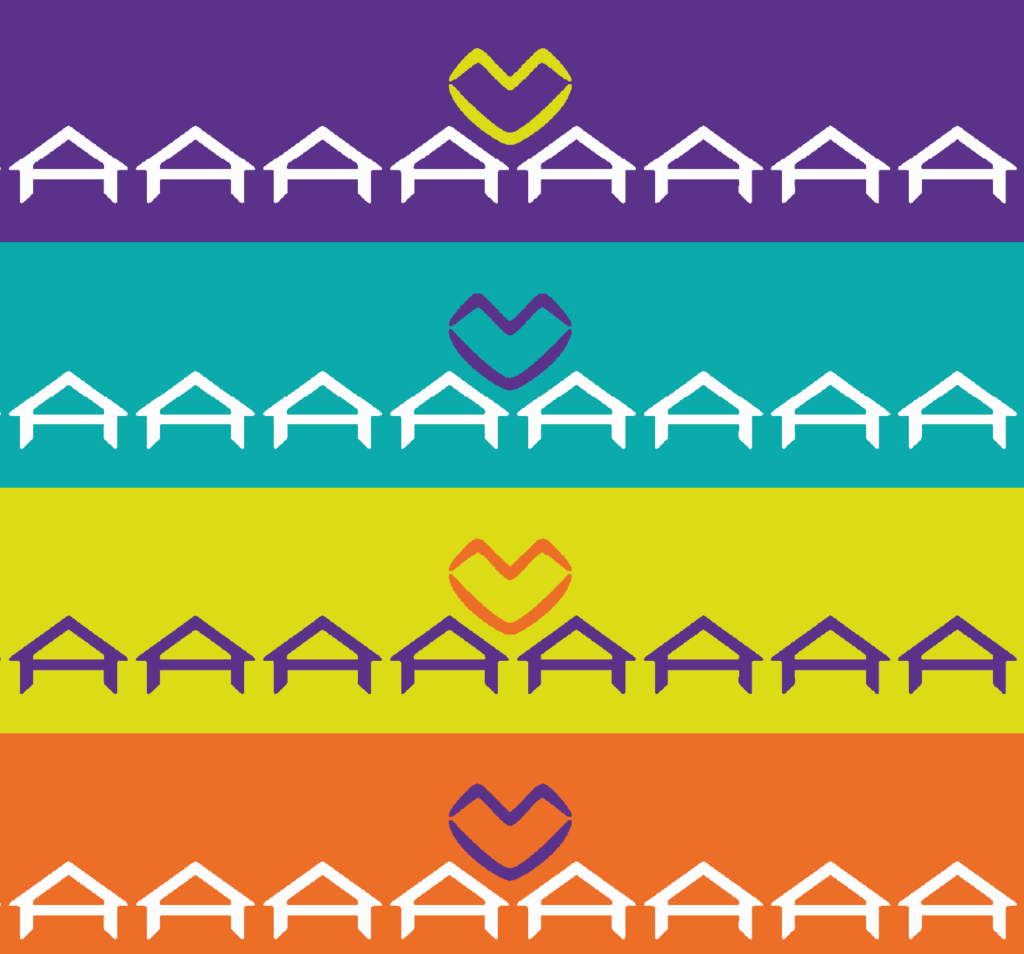
For the visual identity, a symbol was chosen that represented the consonants A, M and V that make up the name and form a stylized fence, alluding to the idea of a village.
The process
Meeting with entrepreneurs: project scope understanding; deliverables definition; possible creative paths discussion.
Competitor’s benchmarking: seeking to identify how market players work on their corporate identity.
Ideas generation: name and corporate identity alternatives exploration, considering the target audience and the entrepreneurs’ work philosophy.
Definition: presentation of the chosen idea; collection of feedback from the client for possible adjustments.
Adaptations and delivery: adaptations of the visual brand identity after feedbacks; creation and development of the visual identity in several communication supports.